

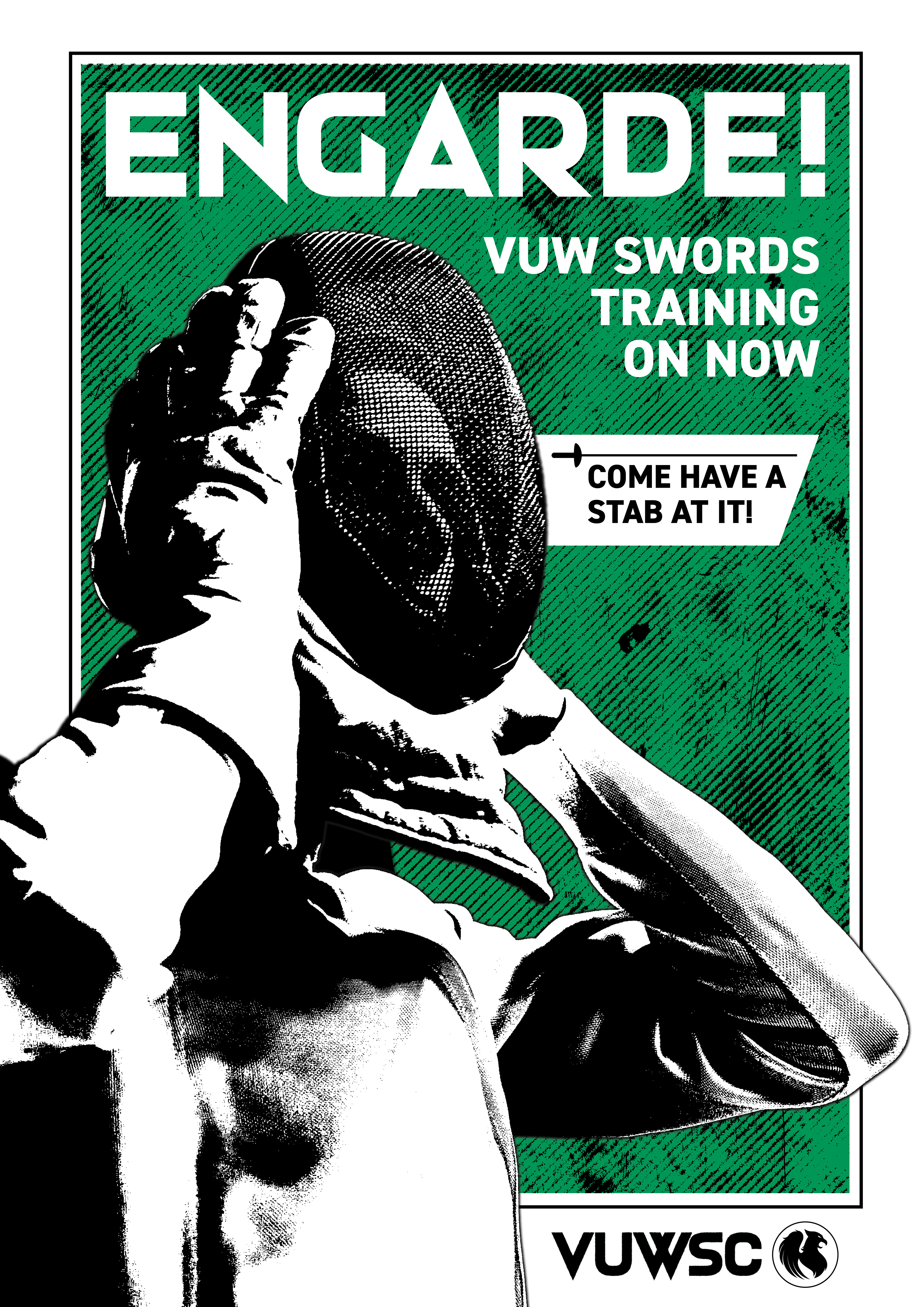
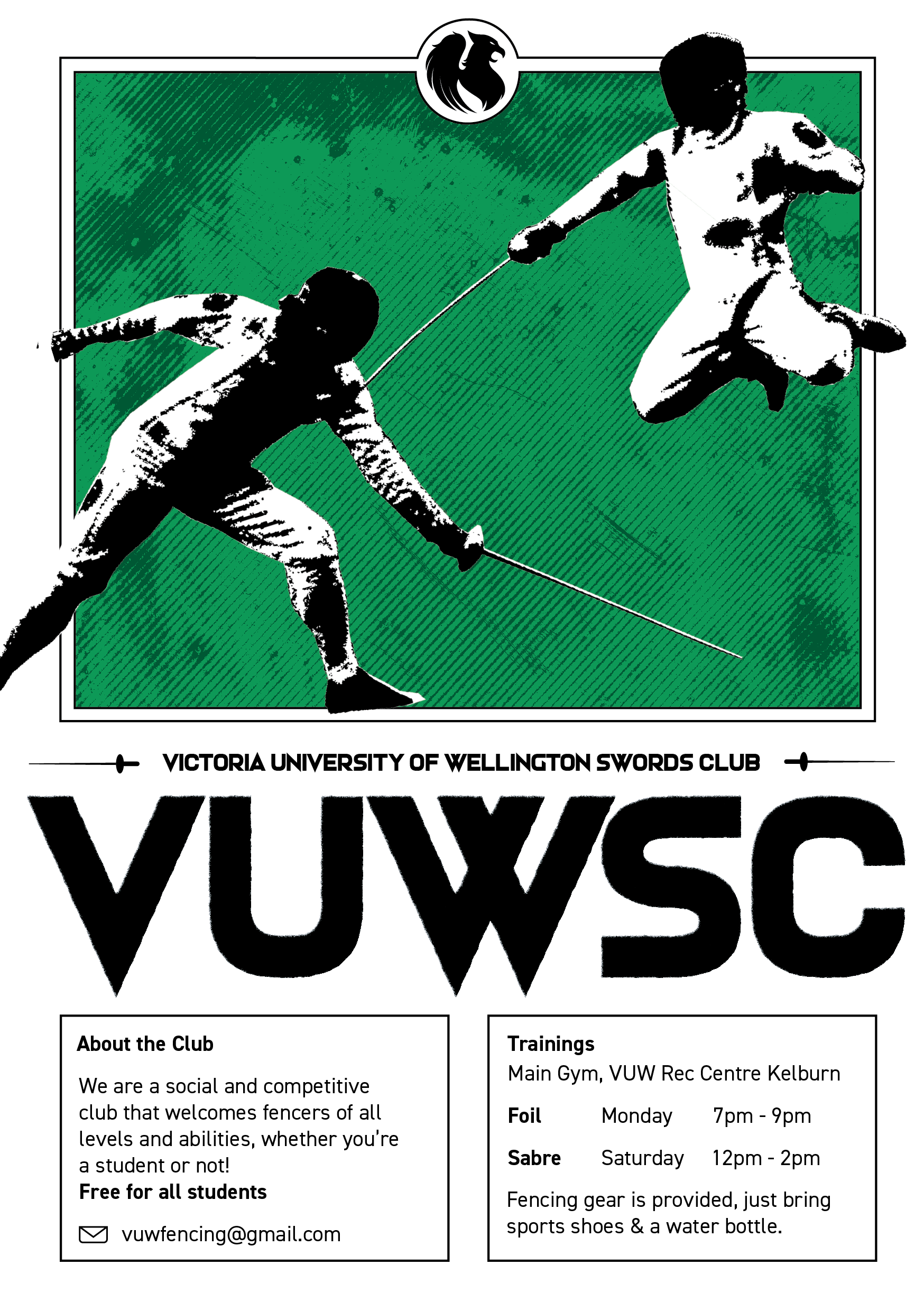
I created a distinct and bold brand for Victoria University Swords Club that utilised their existing club colours and reimagined their badge to an updated style.
I was tasked with encapsulating the feeling of the club so I opted for a grungy textured look. I utlised angluar geometric typography that evokes the powerful yet quick motions of the blade. I also incorporated a strong centered and balanced text layout that contrasts well with the stylised photographs that overlap the edges of the page - emphasising the dynamic nature of the sport.