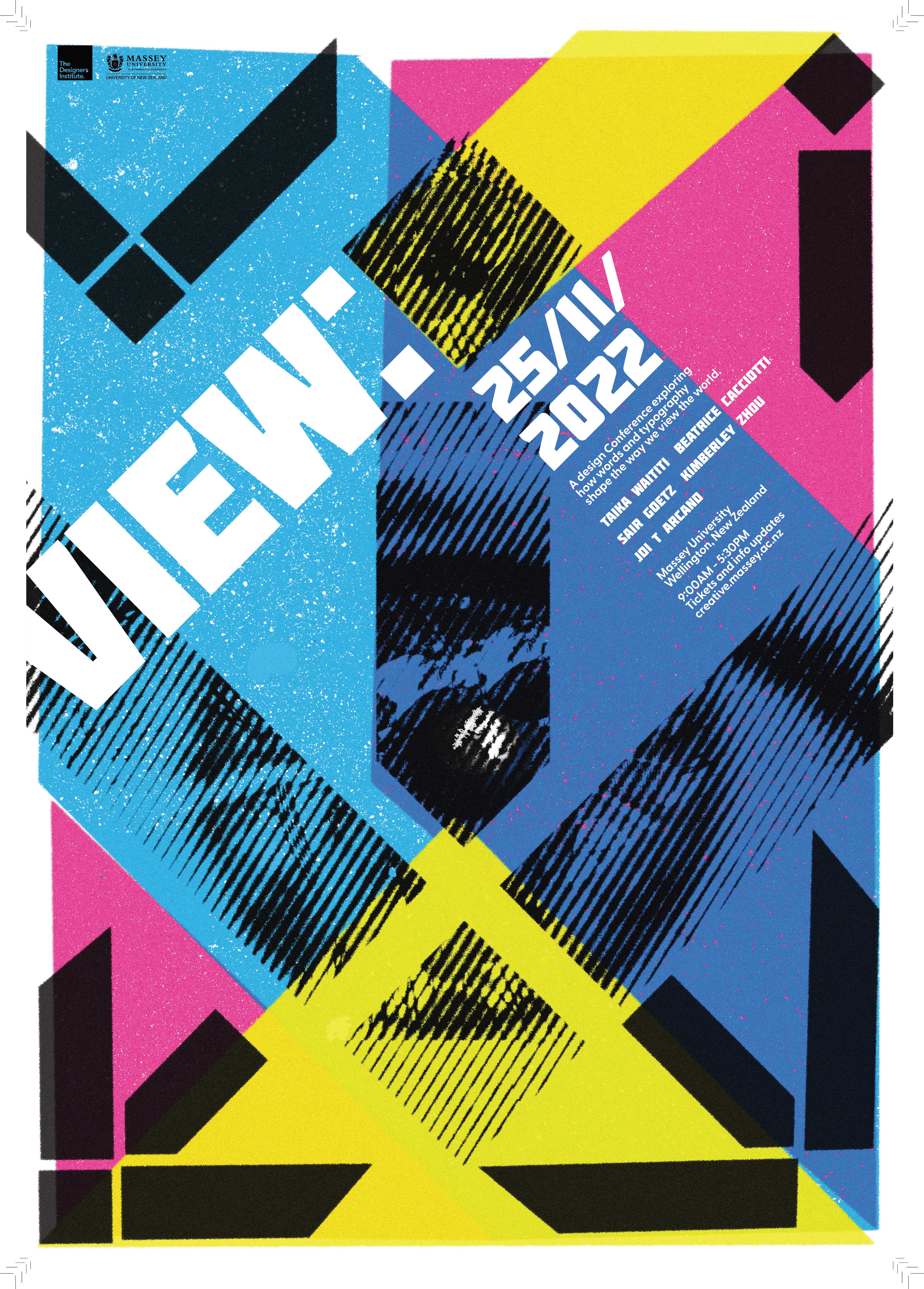
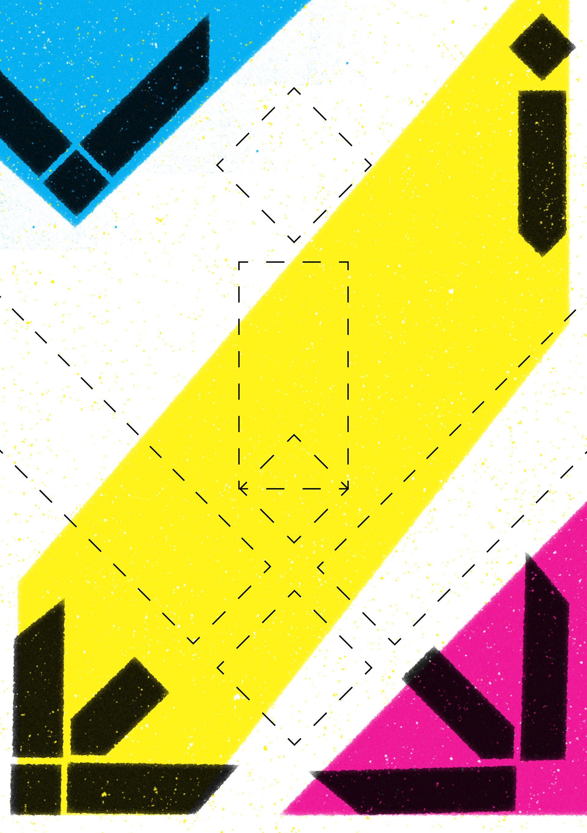
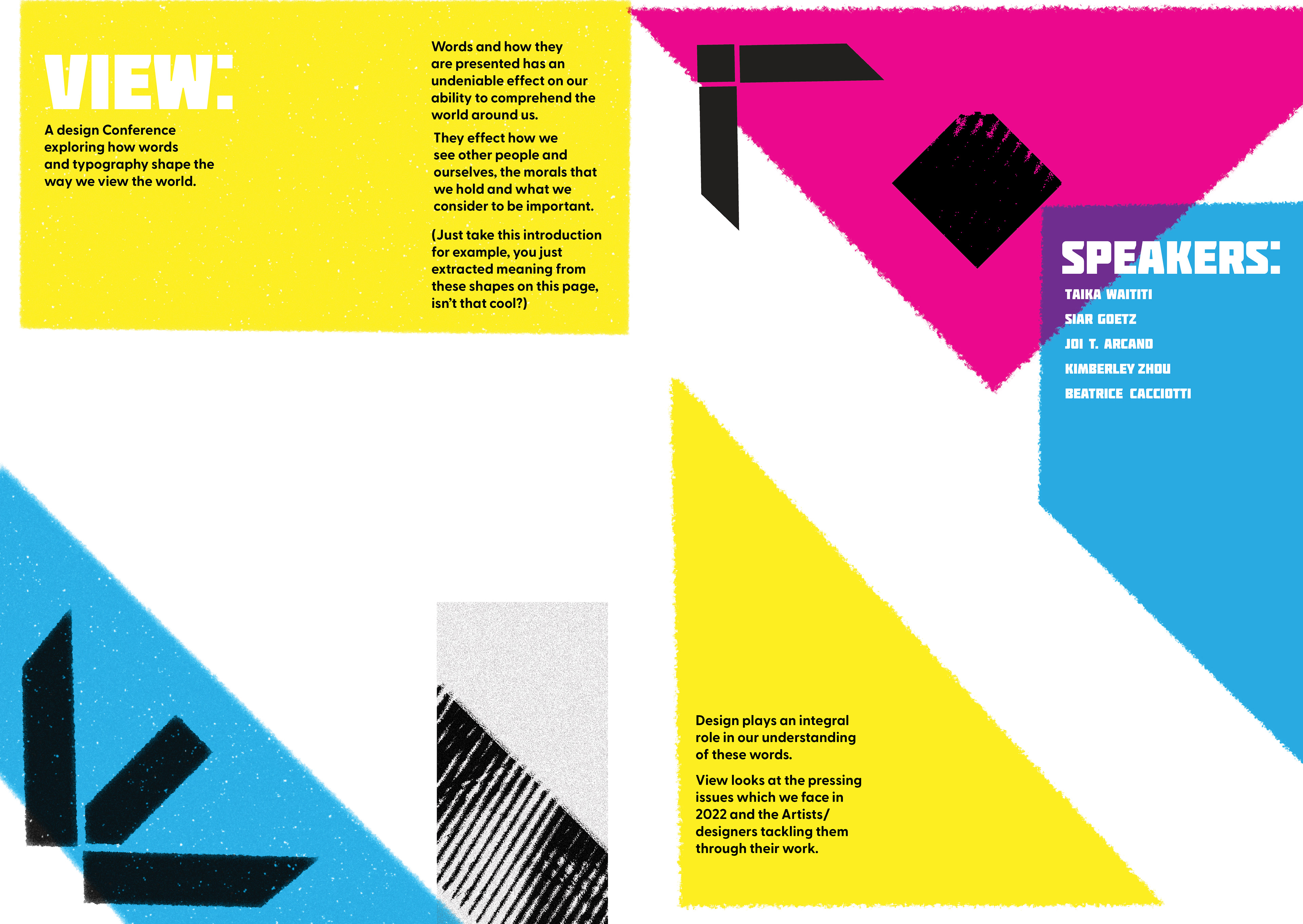

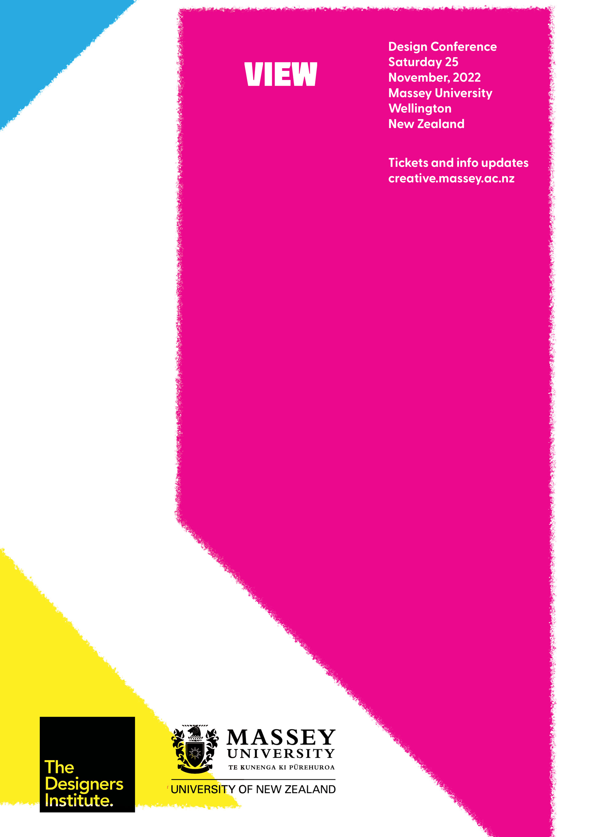

View is a concept for design conference aimed at artists and designers to inspire and inform them about how typography and words can shape our view of the world. I have used bright CMYK colours and a risograph-inspired graphic style in order to convey a mood of vibracy and celebration, while connecting to a design-minded audience.
My logo is a combination of the letters of VIEW, and speaks to the idea of shaping our view through words. My poster, brochure, and touchpoint all play with the idea of shape and perspective in different ways, utlilising my logo as a means to achieve this.
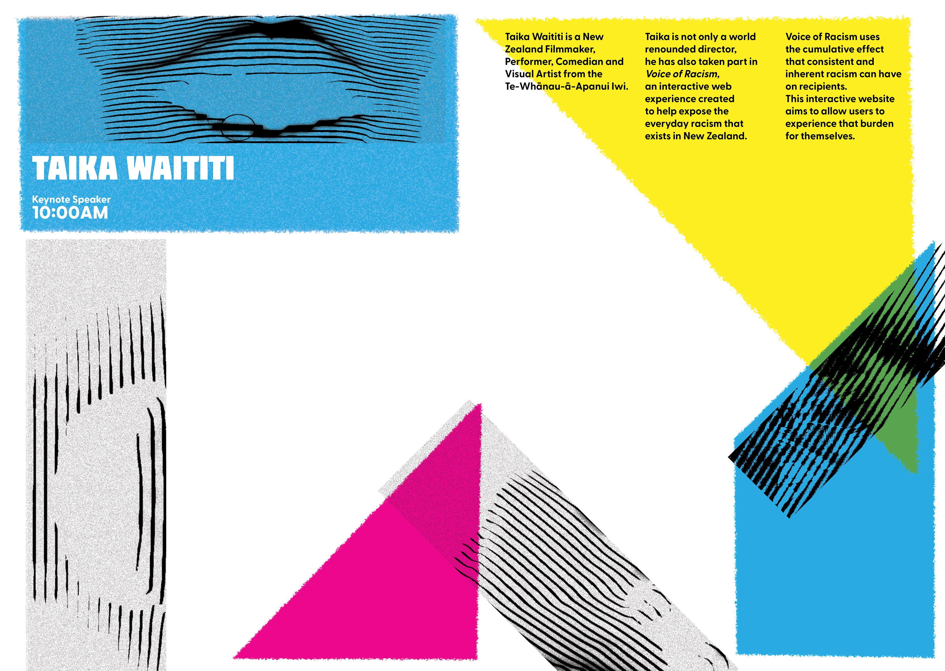
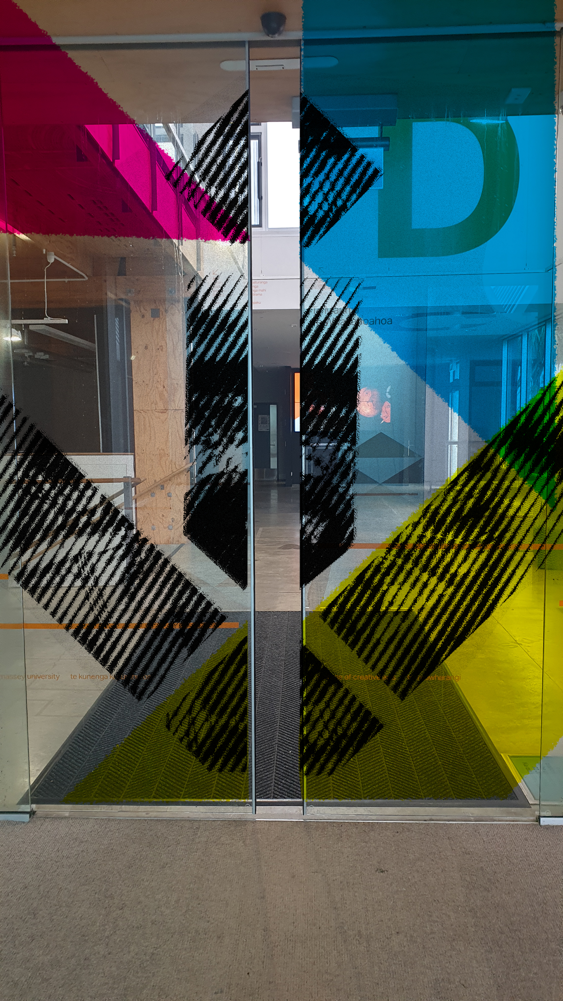
The poster shapes the view by letting a person see through the logo to reveal an eye. The eye engages and draws attention. It is also representative of perspective and the idea of sight.
The brochure has physical cut-outs, through which the audience can see the world. This is a change of perspective from the poster - the poster shows the eye, whereas the brochure shows the world, and your perspective becomes that of the eye in the poster.
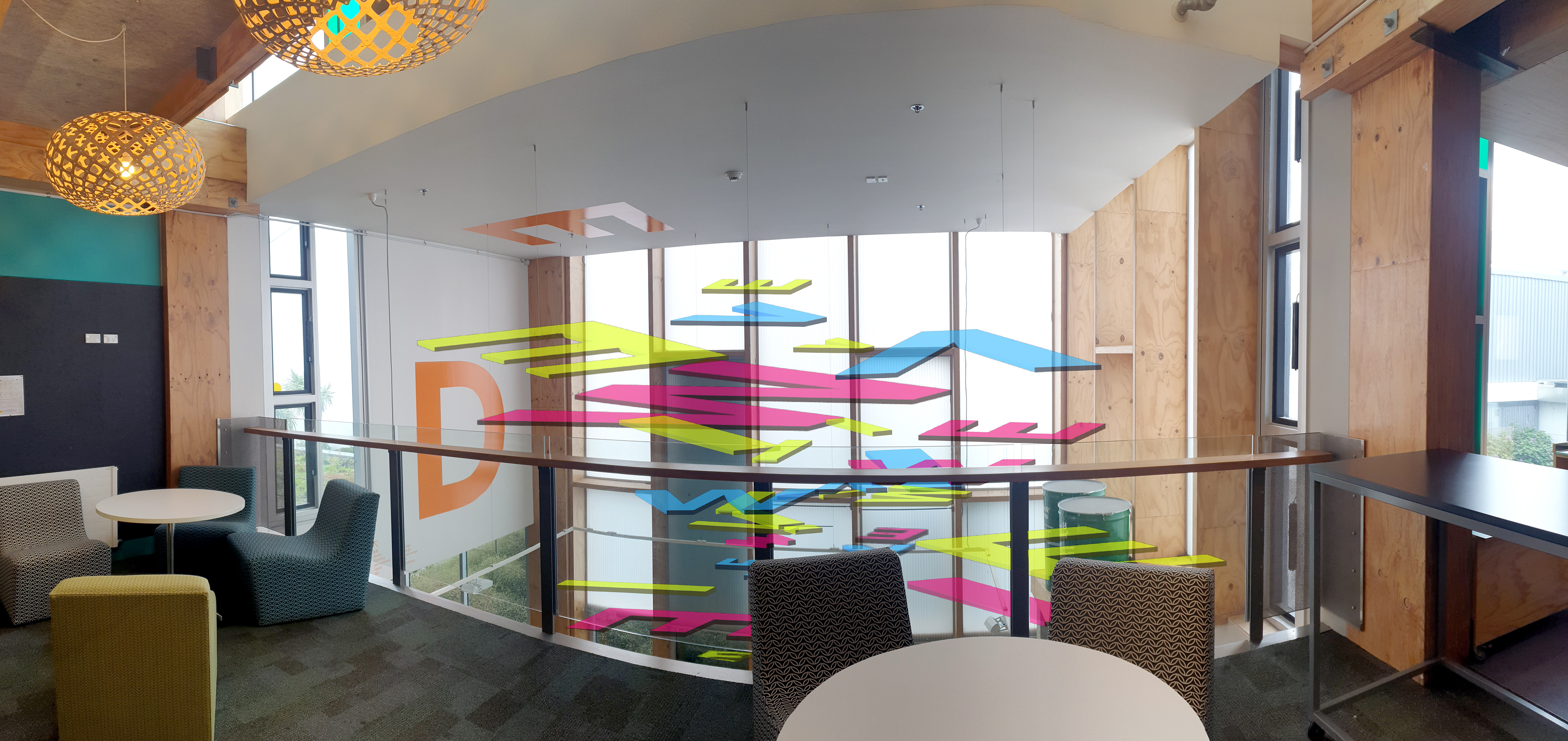
The touchpoint sees the letters of VIEW coming together to create meaning when viewed from a certain perspective - in order to see the logo you must look up from
the floor.
the floor.
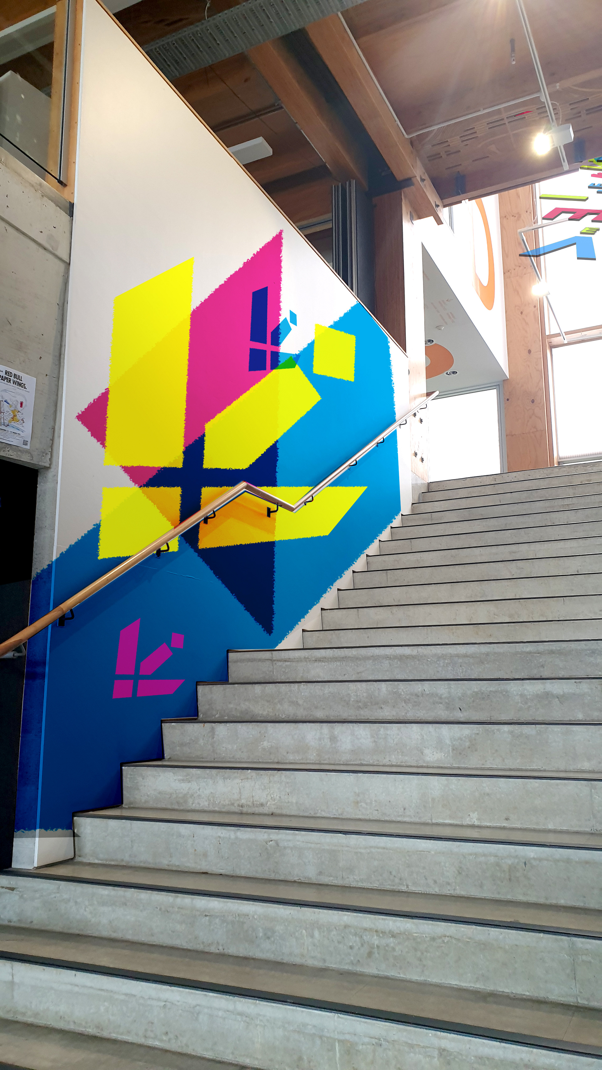
I have also utlised my logo as a wayfinding system, as when turned on its
side it becomes an arrow, leading you through the doors and down the stairs to the lecture theatre.
side it becomes an arrow, leading you through the doors and down the stairs to the lecture theatre.